In this tutorial, we’ll look at how to create a magazine cover in InDesign. You’ll learn how to set up a page layout and add text. This is an introduction to InDesign and no previous knowledge is required. This is a simple project put together to help get you started with InDesign. Let’s get to it!
Final Image Preview
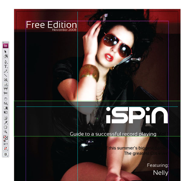
Below is the final design we will be working towards. Want access to the full Vector Source files and downloadable copies of every tutorial, including this one? Join VECTORTUTS PLUS for just $19/month.

Step 1
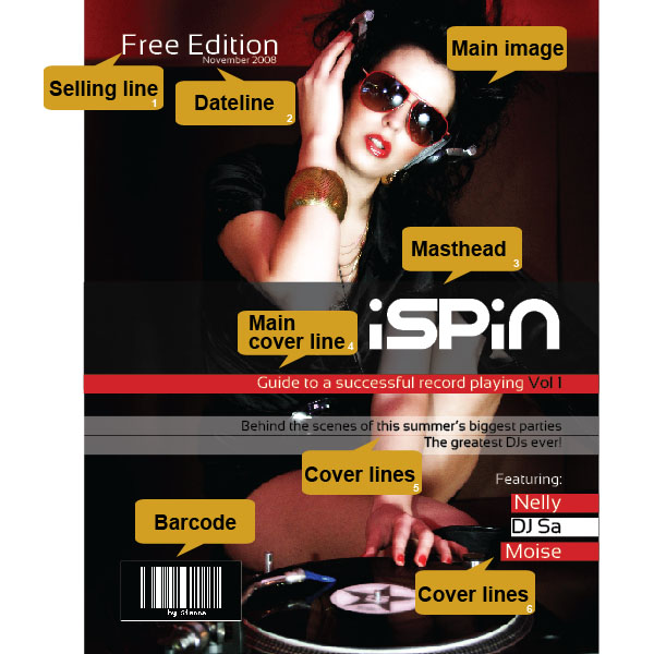
First, let’s have a look at the common elements of a magazine cover. I outlined the most important parts below in the image for you. The most important element are the main image chosen for the cover and the masthead, which is nothing else than the title of the magazine. Usually below the masthead you can find the main cover line acting as a punch line. Cover lines usually introduce the contents of the magazine. Other elements are a dateline indicating the date and last but not least a barcode.
Step 2
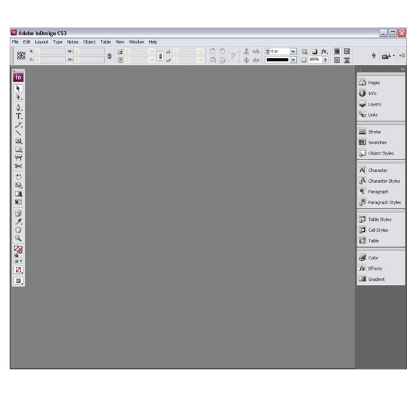
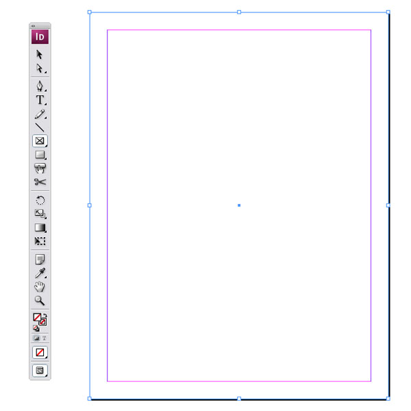
Let’s get started. Open up InDesign and have a look at the main frame of the software. The layout is similar to Illustrator with the toolbar on the left, the palettes toggled on the right and various tools on the top.
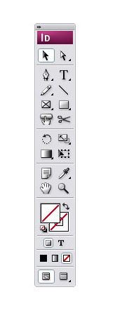
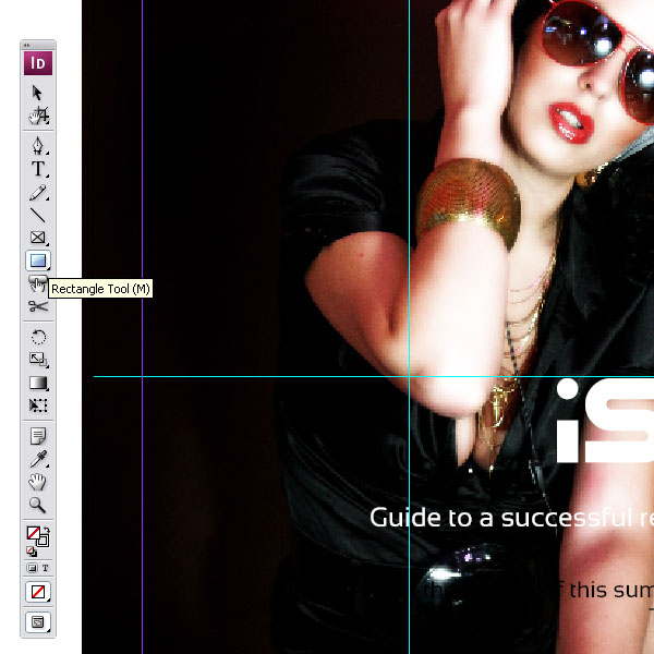
Step 3
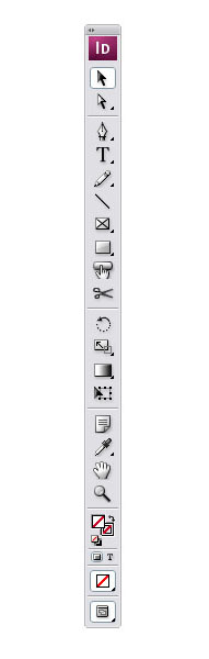
Let’s look at the toolbar. On top you can find the Selection Tool (V), below the Direct Selection Tool (A). Right after the Pen Tool (P) and below that the Text Tool (T). We have also a Pencil Tool (N) and Line Tool.
Step 4
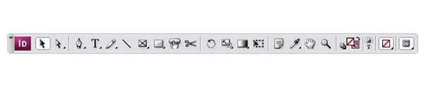
There is a really neat way to arrange the Toolbar horizontally by clicking on the small arrows on the top left corners.
Step 5
Or you can split the tools into two rows in a vertical fashion by clicking the arrows one more time. If you would like to go back to the original one line vertical bar, just click it again.
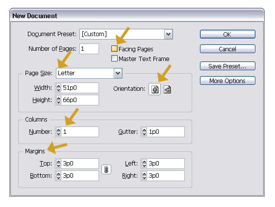
Step 6
Go to File > New > Document (Command + N). You will get a pop up window like you see in the image below. To start easily, deselect the Facing Pages button, make sure you selected Letter size and only choose 1 column. The margins are preset and you can leave them like they are.
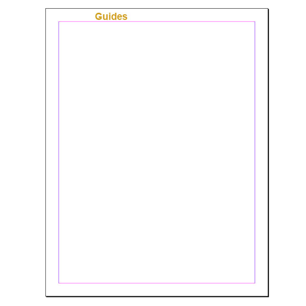
Step 7
This is the document that you will get. The pink/purple lines are the margin guides and can be turned on and off (Command + ;).
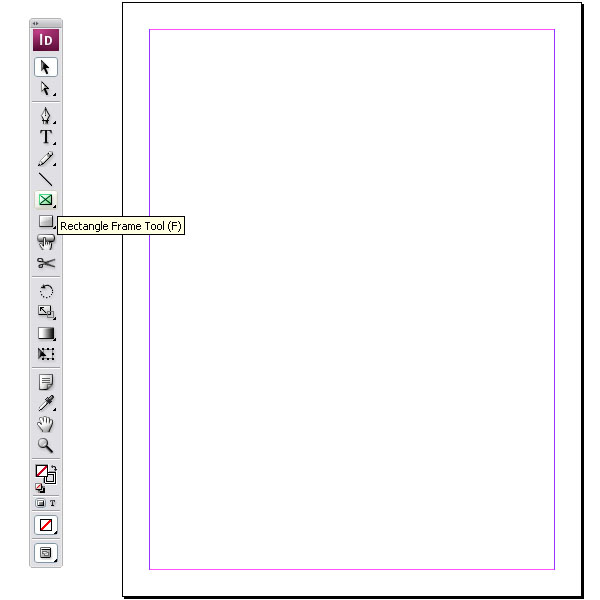
Step 8
First thing we need is the Rectangle Frame Tool (F). This will help us place our image. Select the Rectangle Frame Tool (F).
Step 9
Now start dragging from the top-left document corner downwards to the bottom-right one.
Step 10
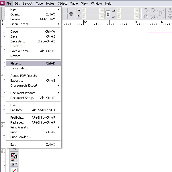
I have selected an image from stock.xchng. Feel free to choose whatever image you like. Make sure that you have created a folder just for your InDesign file and your image. They should be in the same location. Go to File > Place and in the popup window choose the image that you would like to place and hit OK.
Step 11
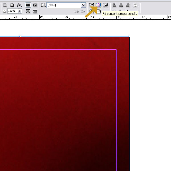
Since we placed a frame, the image might be too big for it. Without distorting the image, you can fit it proportionally. The tool button for this can be found on the top, next to the align buttons. If you hover over any of the tools, they will reveal their names. Click it once and the image will be automatically fitted.
Step 12
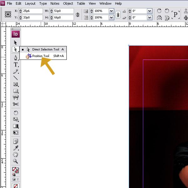
Next we need to move the image around. But we don’t want to move the frame itself. We can do that by selecting the Position Tool (Shift + A). You can find it under the Direct Selection Tool (A). Just click on the black small arrow and the drop down will appear.
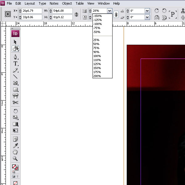
Step 13
When you move the mouse now over the image, a hand will appear and you can move the image around within the frame. I made it a little easier for you and set the image to 28% this will set the image size right for the frame. It all depends which part of the image you want to reveal..
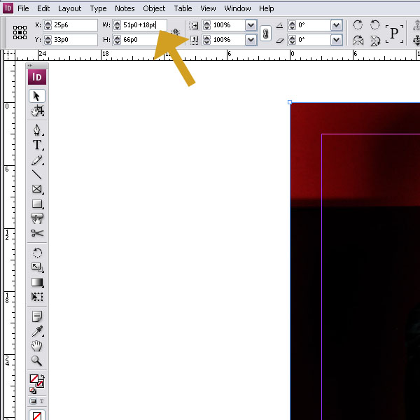
Step 14
An important step for a layout is to add bleed. Bleed is an additional amount of image that extends beyond the edge of the page layout to ensure a full color coverage. It is later trimmed off by the printer. InDesign is just as smart as Illustrator and can act like a small calculator for you. Just type literally +18pt to the width and height. By hitting “Enter” it will be added to the frame dimension. (9pt on each side).
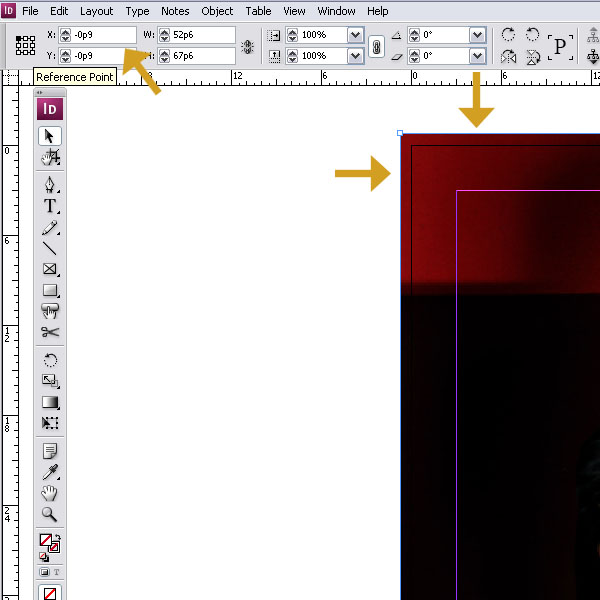
Step 15
After that we want your frame to be centered both vertically and horizontally. Select the frame with the Selection Tool (V) and then hit the top left small corner of the Reference Point to set the origin. Then set theX and Y coordinates to -9pt. InDesign calculates in picas and point (or whatever measurements you have set up). Make sure you always type pt behind a number. InDesign will automatically convert them into picas and points (1 pica is equal to 6pt).
Step 16
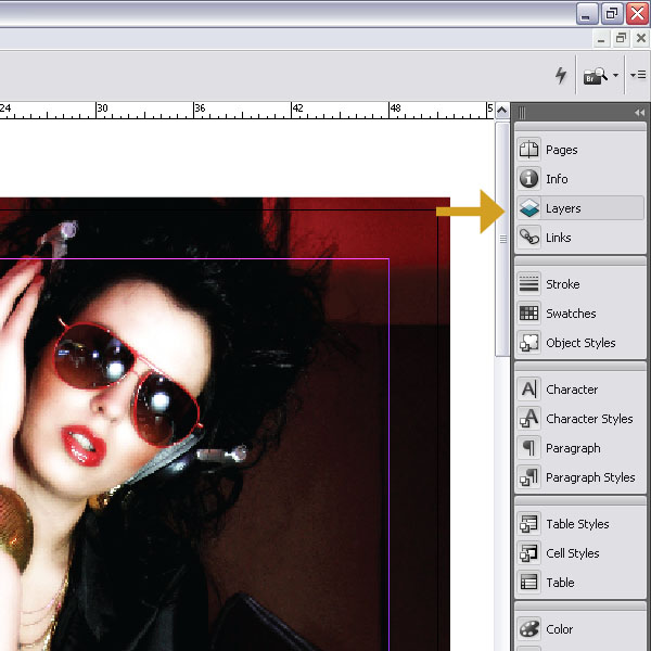
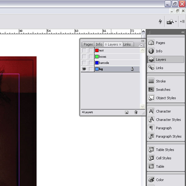
InDesign has layers just like Illustrator. You can find the Layers Palette on the right edge. Usually the main palettes are toggled there.
Step 17
I set up four layers. One for the background image. Then one for the barcode we will add later, another for some boxes and one for the text. It makes it easier to hide and lock elements that
way.
way.
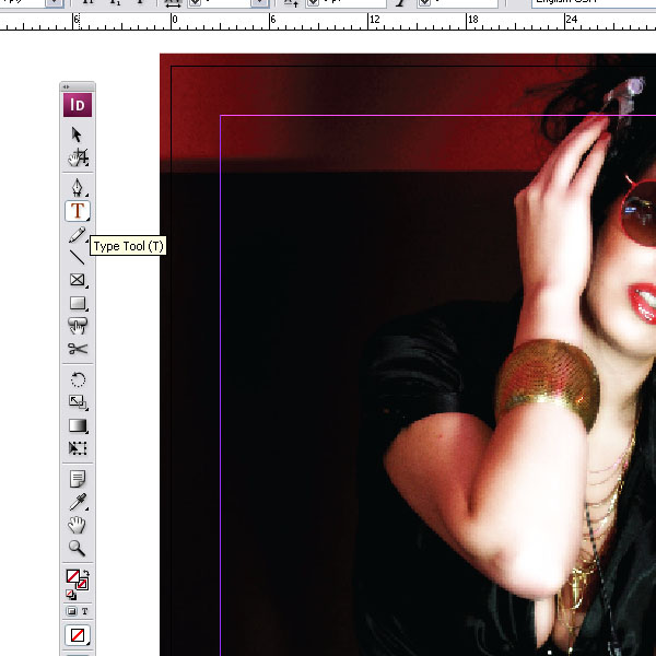
Step 18
Let’s add some text to our magazine cover. Select the Type Tool (T).
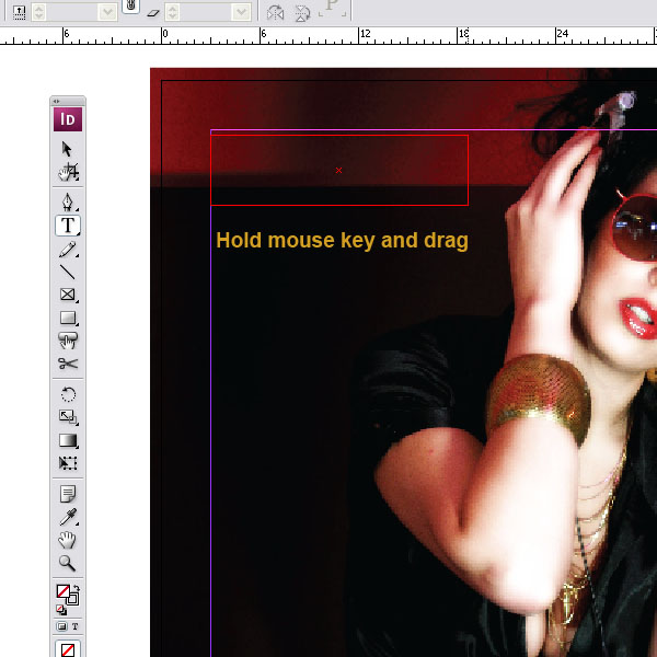
Step 19
Then start dragging a type box by holding down the mouse key and pulling downwards.
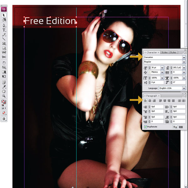
Step 20
I typed my text and aligned it left. You can open the Character and Paragraph Palette. I chose a font called Sansation. You can download it here at Dafont.com.
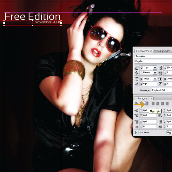
Step 21
I added another Type box just below and right aligned it and set the font weight much smaller. This will be the Selling Line and the Dateline. It helps to drag a guide onto the artboard.
Step 22
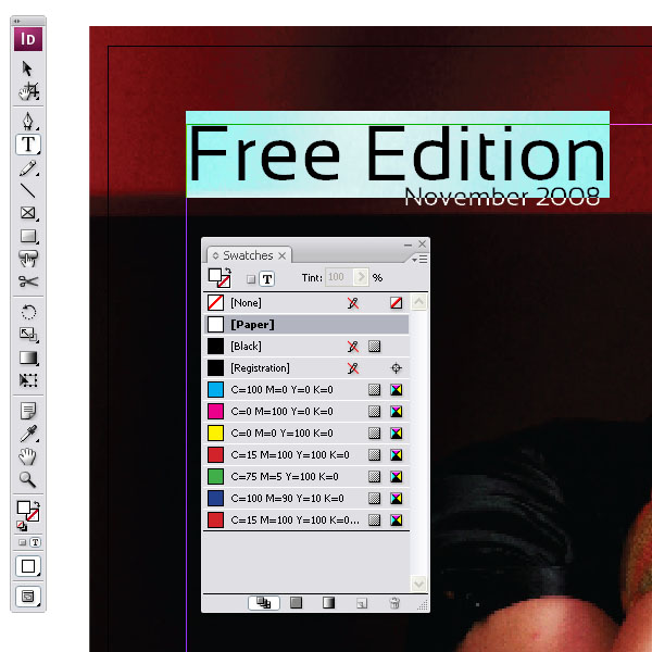
Just to show you how you can change the color of the text, highlight it with the cursor and open the Swatches Palette and choose Paper as a color.
Step 23
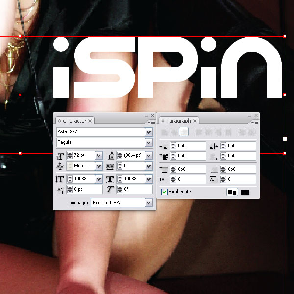
Towards the middle on your magazine cover layout, I created yet another Type box and added the masthead (title). I chose a font called Astro 867 from Dafont.com. I right aligned it with the margins of our document.
Step 24
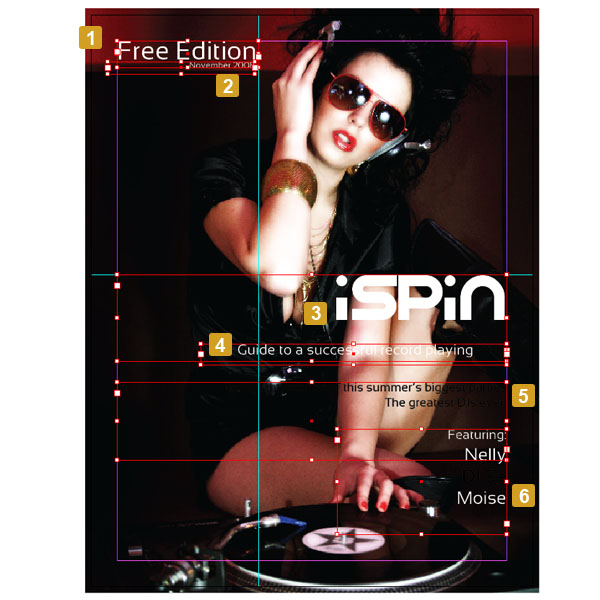
I outlined the text boxes I created for the cover. All together I have six text boxes. Colors, fonts, and sizes are totally up to you.
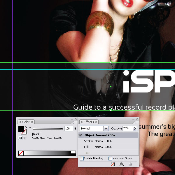
Step 25
To give the text a little bit more punch, you can add a box behind it. Make sure that you will put it on the layer below the text layer. Select the Rectangle Tool (M).
Step 26
Start dragging a box across the entire frame including bleed by holding down the mouse key and dragging downwards and across.
Step 27
Fill the rectangle with black and set the Opacity to 75%. You can do that via the Effects Palette.
Step 28
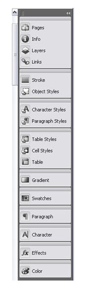
Just in case you got confused, I took a screen shot of the palettes that are toggled on the right. Of course you can customize them and order them as you wish.
Step 29
Here are the boxes that were added behind the text. I have seven rectangles with various colors and transparencies.

Step 30
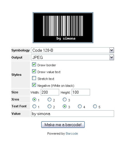
Now just to have some more fun, we can add our custom barcode image. I found a place for you where you can create your barcode for free and download the image. Feel free to choose whatever size and name. I chose a negative instead of a positive and set the value to: "by simona."
Step 31
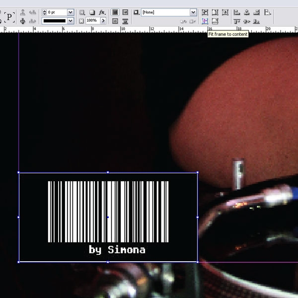
Back to the InDesign file. Place another frame with the Rectangle Frame Tool (F) just like we did in Step 9. Place the barcode image you downloaded into your folder (Command + D) and into the frame. Next, resize the frame this time to fit the image by clicking on the Fit Frame to Content Button. Place the frame with the barcode into the bottom left corner.
Step 32
Have a look at the final design. Of course this is a very simple layout. I hope nevertheless this will give you an insight into InDesign and maybe if you stick around, there might be some multi-page layout tutorials on the way.
Conclusion
I hope you enjoyed the introduction to InDesign and how a magazine cover is set up or better what elements are important to the layout. Please let your imagination go and maybe you will get some ideas for your own magazine.
terimakasih tutornya
ReplyDeletethanks buat infonya gan,, nice post...
ReplyDeletehttp://acemaxs86.com/